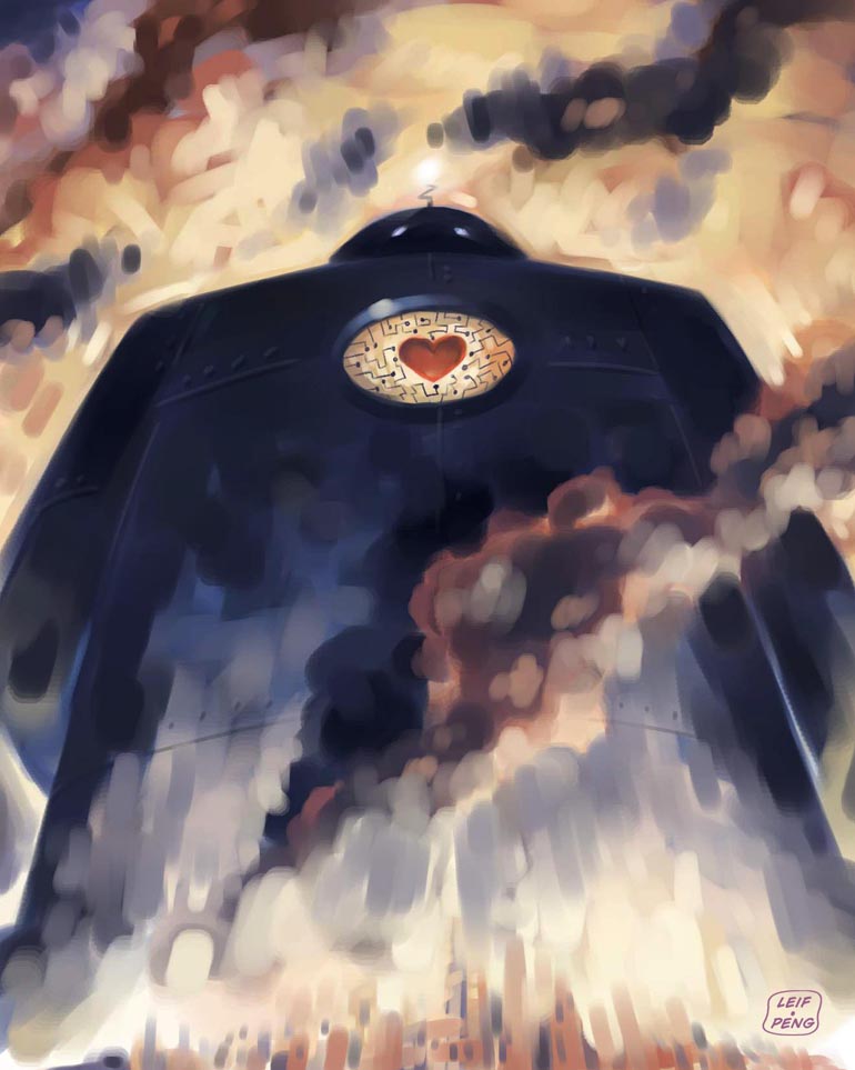
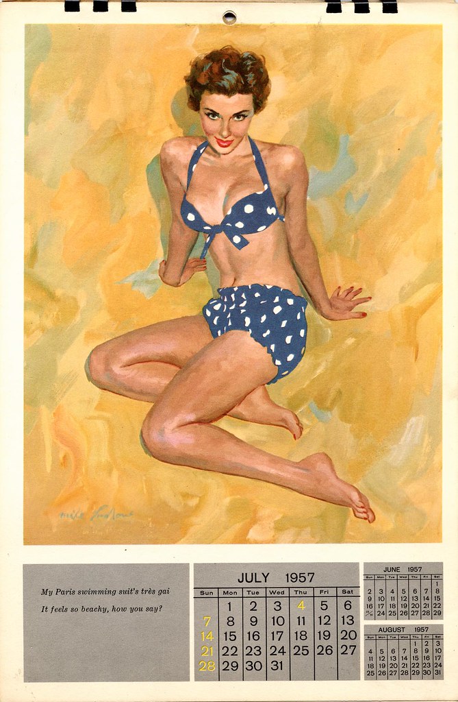
All the originals, done in acrylic airbrush colour on watercolour paper, are long gone. But I did have enough forsight to make colour copies at the time. Here are five of the six covers from my hated book cover series...


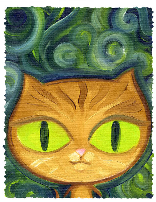 This little green-eyed cat is my favourite, but I did a bunch of other paintings which you can see in a set on Flickr
 I did two of these paintings and they were so well received when I posted them on Facebook that people started commissioning me to do similar paintings of their cats!
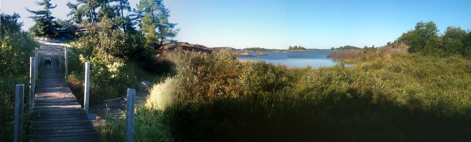
 ... which has so many lovely views of the surrounding landscape!
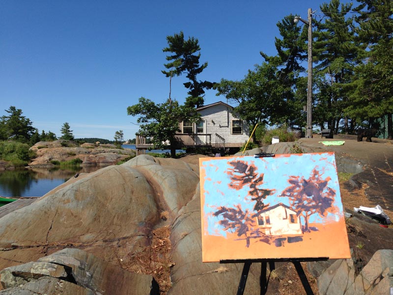
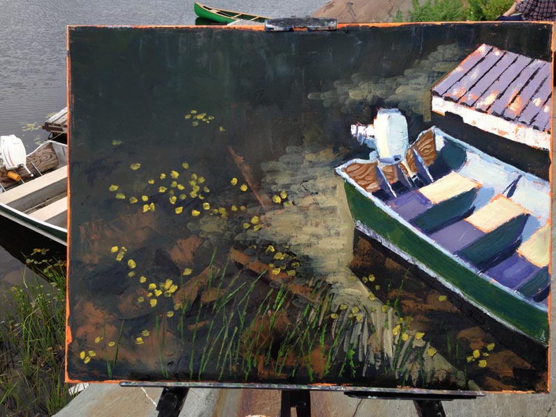
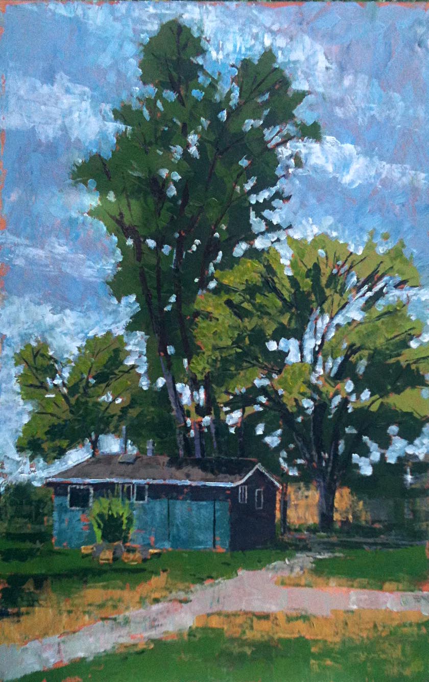
 But sometimes you needn't look to the horizon for beauty... sometimes it's as close as the parking lot, which is where I sat one afternoon and painted this:
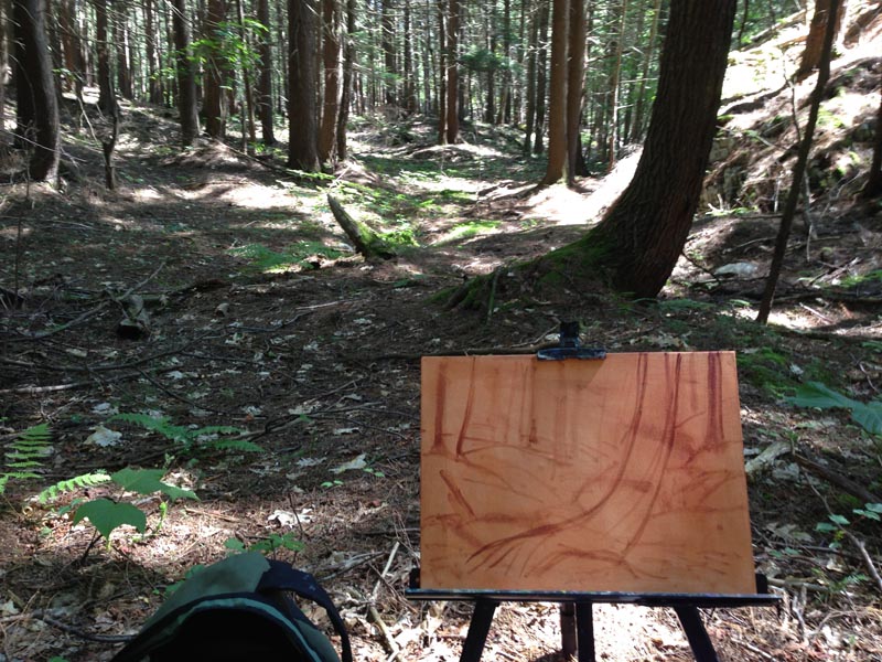
 Just down the road from the lodge is a wonderfully ramshackle old garage. On the Tuesday of that week I took all my gear down to a shady grove across the road from that building. Three hours later, I had this piece mostly done...
 Backing up, on the Monday of our week in Whitefish Falls I started a painting of the bay inlet - a view from right outside our cabin on the little island...
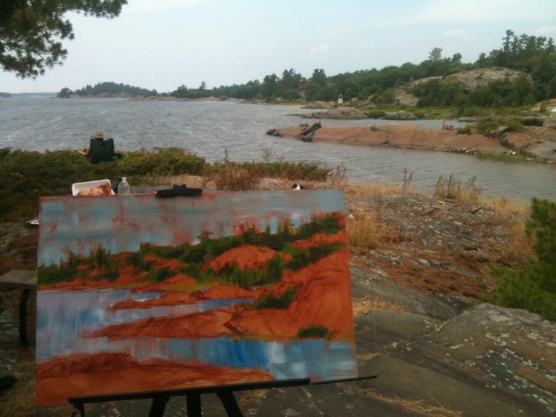
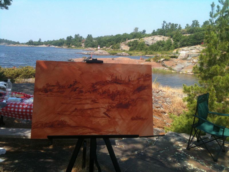 Above, sketching the scene in paint - below, laying in broad swathes of colour with a palette knife...
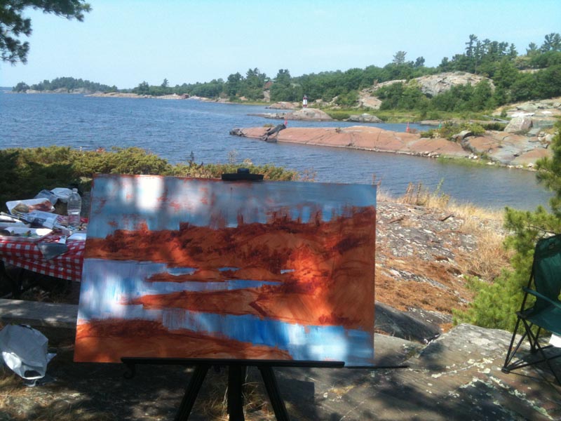 ... and brush...
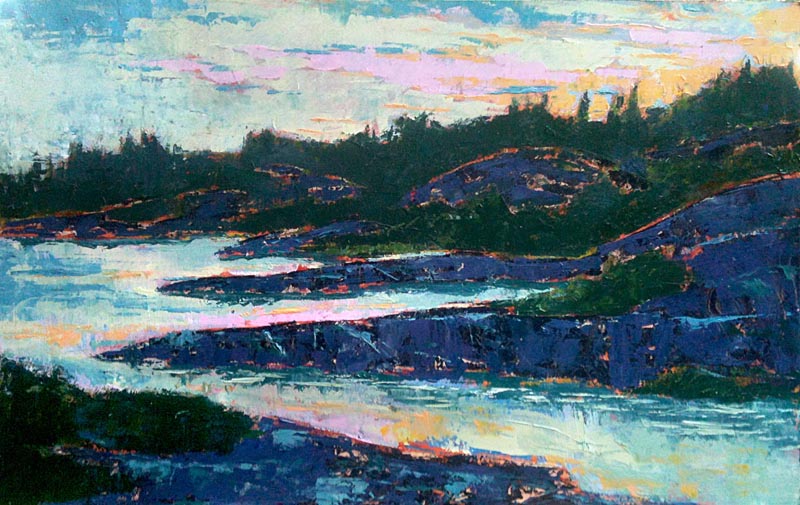
 After about 3 hours, I arrived at a satisfactory conclusion... well, not exactly "satisfactory." Although I wasn't unhappy with how I'd blocked in the scene, the full daylight look just wasn't working for me. So I turned this painting to the wall.
 That evening we enjoyed a most spectacular sunset. This is the scene I felt I really wanted to portray! I returned to this painting on our last day in Whitefish Falls and painted it over from the memory of that sunset.
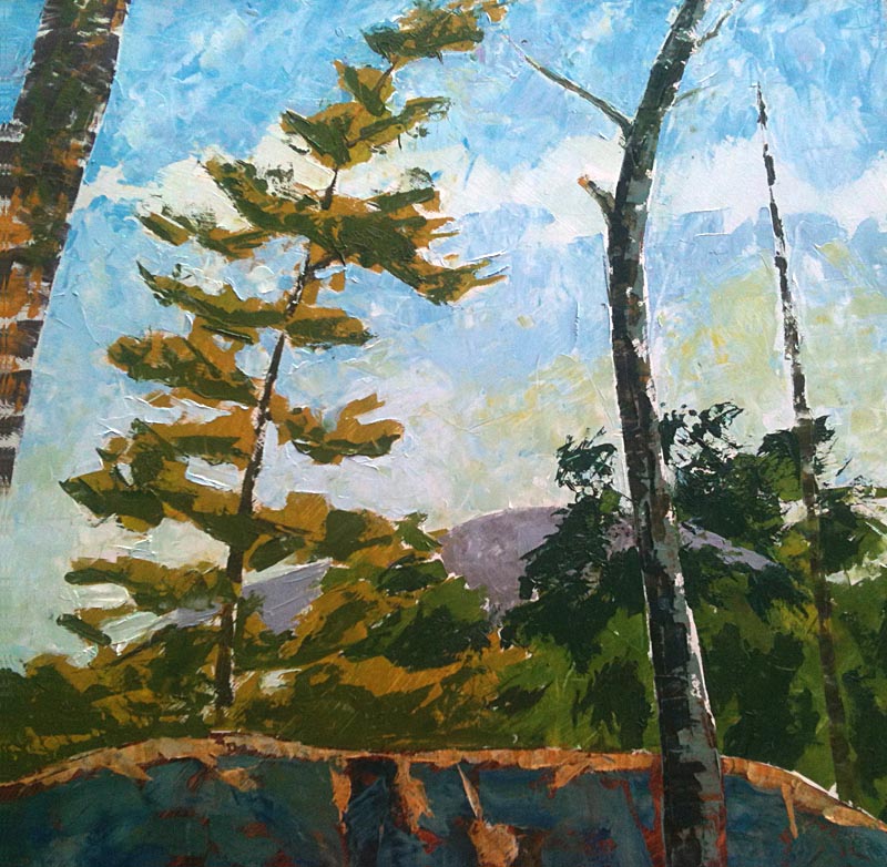
 One other painting came out of our week in Whitefish Falls; this "View to the Willisville Mountain," also as seen from just outside our cabin on the island - except turning to look more to the North.
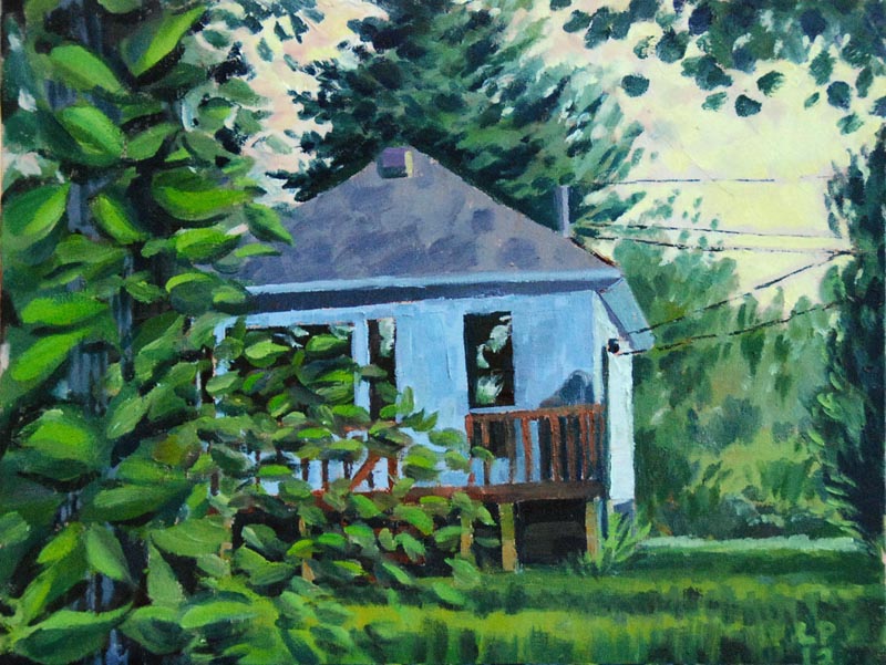
 Returning home to Hamilton, I still had the plein air painting bug. One spot I'd wanted to paint for a couple of years now is a farm at the corner of Puslinch Townline Rd and Victoria Rd. So one evening I drove out there and set up in the corner of the farmer's field.
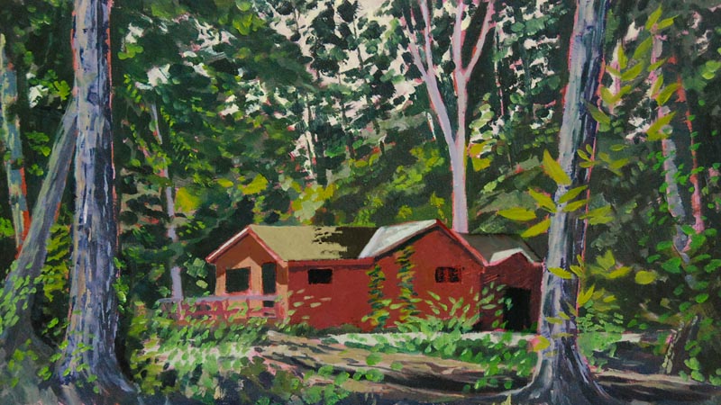
 The following weekend I travelled back up north for my annual fishing trip with a great group of pals. I spent the Friday night at my buddy Mike's cottage, and that provided the perfect opportunity to do a little painting!
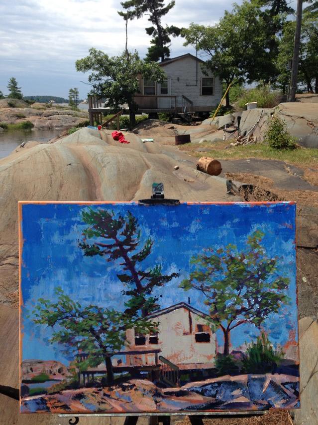
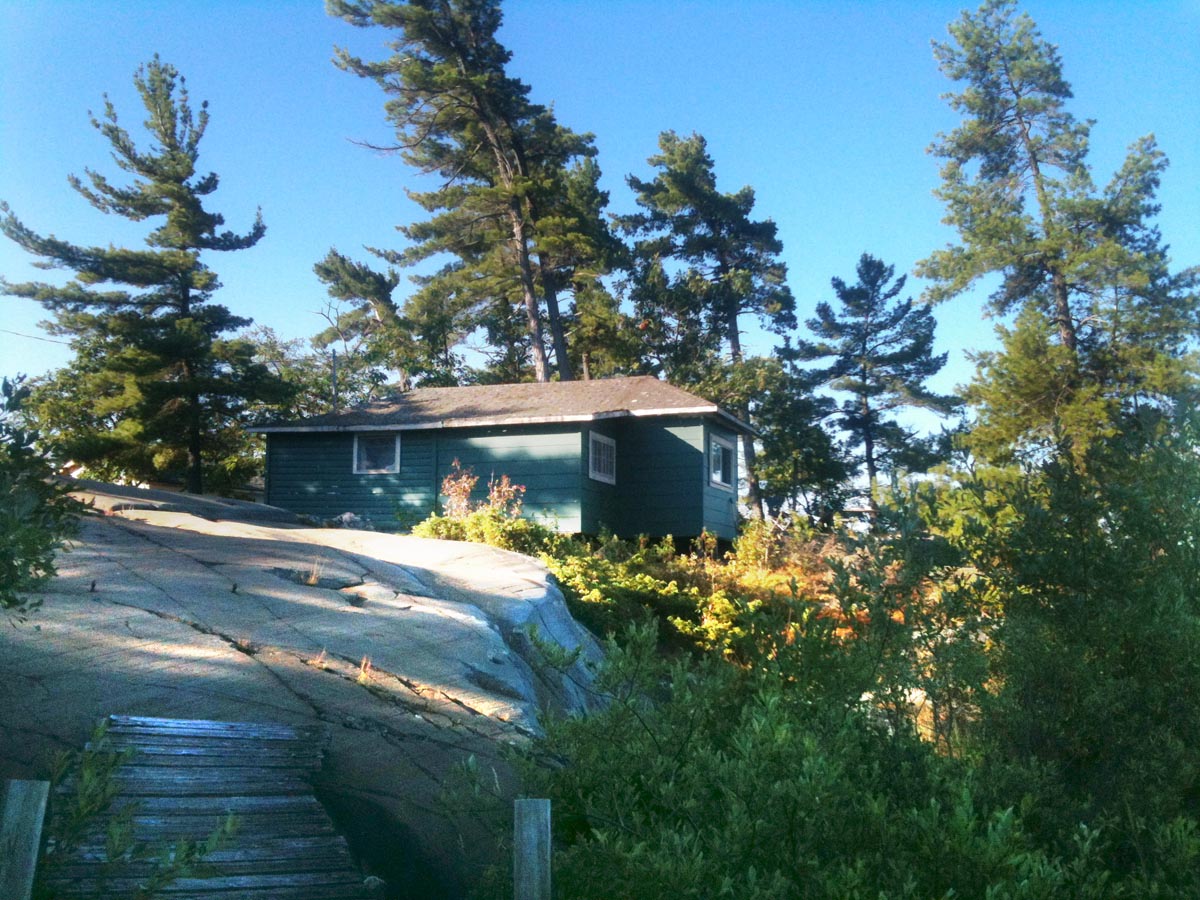
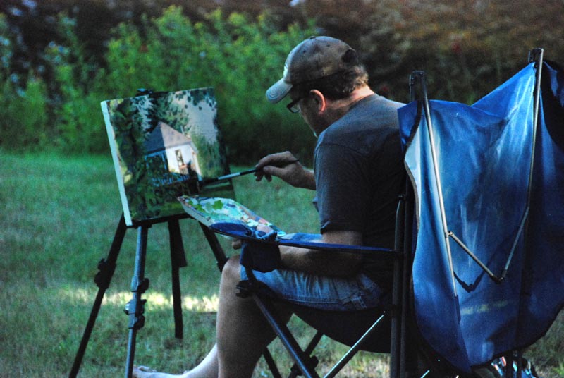 Mike has done so much for me over the years that I was delighted to be able to present him with a small token of my appreciation: this painting of his cottage, which he seemed really pleased to receive.
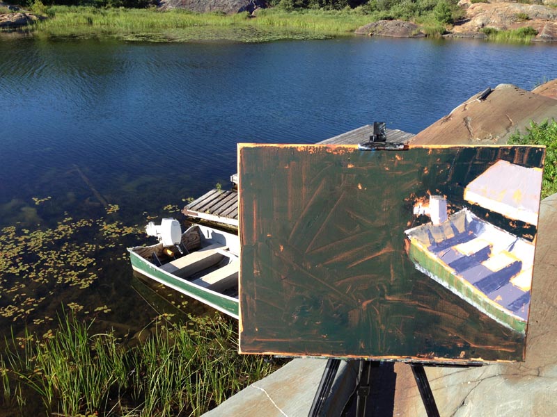
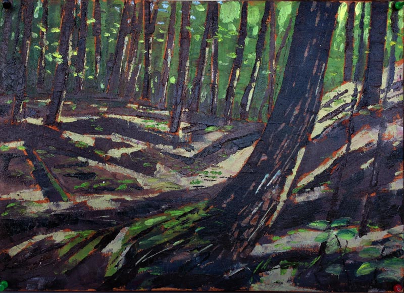
 Travelling further on up north to the Oxtongue River, to our friend Wade's family cottage, where we have held the fishing derby for many years now, I spent about eight hours over two days painting in a little grove of pine and hemlock trees. This view of the Lovell family cottage is the result.
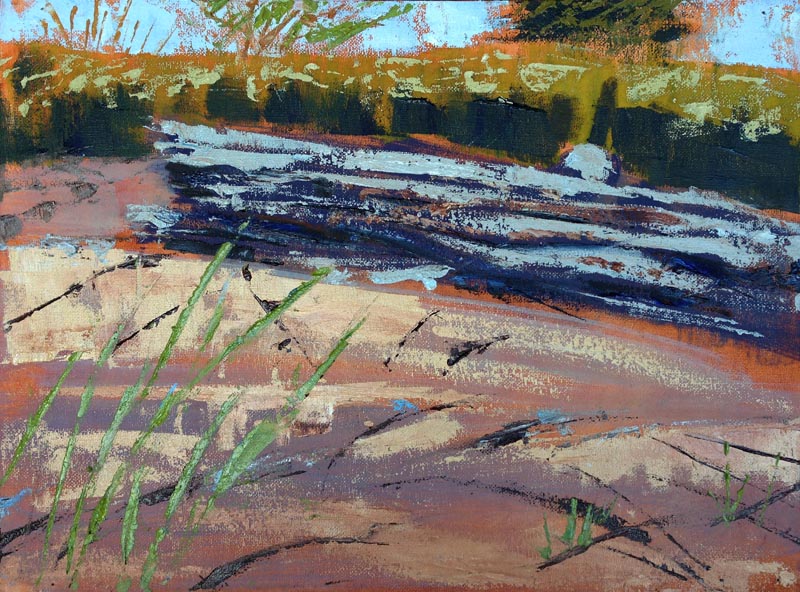
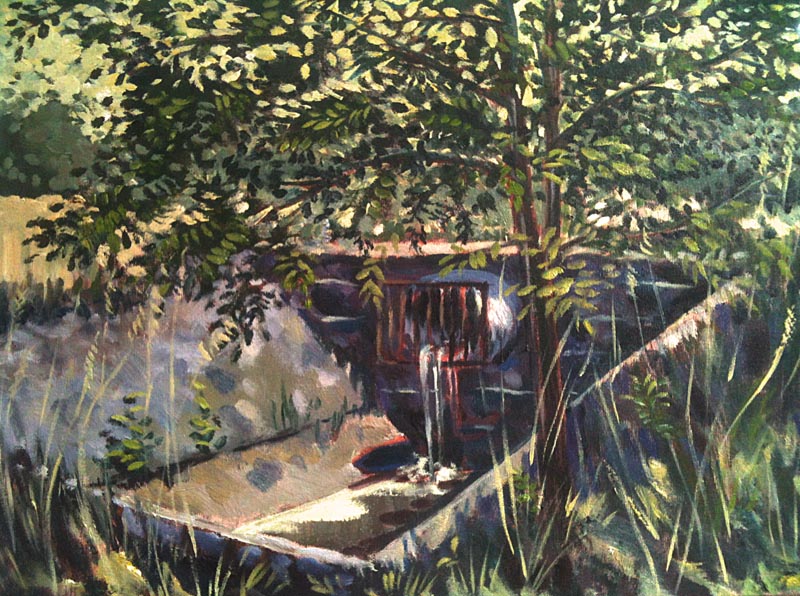
 And finally, upon returning home to Hamilton once more, I painted this view of a storm sewer - that's right, a storm sewer. It's in a tiny, forgotten meadow near here... so jarring to see it in the middle of such a beautiful, natural environment... I've wanted to paint it since last year. Last Tuesday I did!
 Today (Saturday August 11th) I'll be bringing these paintings and quite a few others I painted last summer to the Locke St. Art Market, 211 Locke Street South, Hamilton, Ontario
If you're in the area and have some time, please drop by and say hello!
Today (Saturday August 11th) I'll be bringing these paintings and quite a few others I painted last summer to the Locke St. Art Market, 211 Locke Street South, Hamilton, Ontario
If you're in the area and have some time, please drop by and say hello!